The pursuit of the most elusive of goals - graphic design harmony.
Not a road to design enlightenment, more like a river flowing to the sea.
Our own path at this point is taking us down the route of interesting details and finishes - as we produce captivating graphic design solutions to our projects, the method in which the design is presented becomes equally important. The binding, cover, selection of stock weight and finish all have a huge impact on the final... IMPACT. Thats what we are here to help with, as we develop solutions that are appropriate to your message and within your design budget. We recently used a half canadian wiro bind on an annual report, allowing the large pages (300 x 300mm) to sit flat on the desk when reading - maximising the punch of the now maximised canvas. The effect is impressive. The solution though was apparent because we understood the message to be conveyed and incorporated that into the graphic design solution.
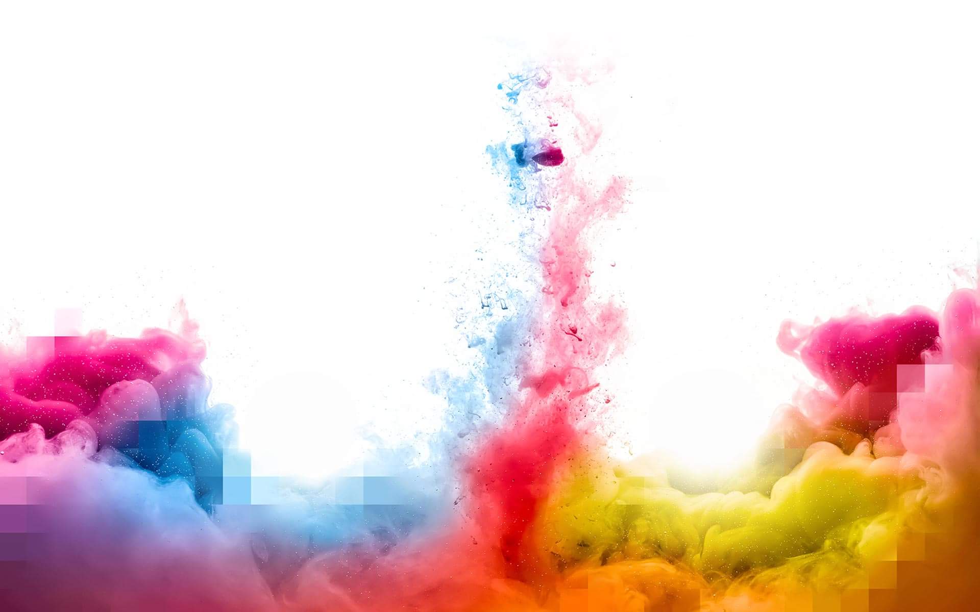
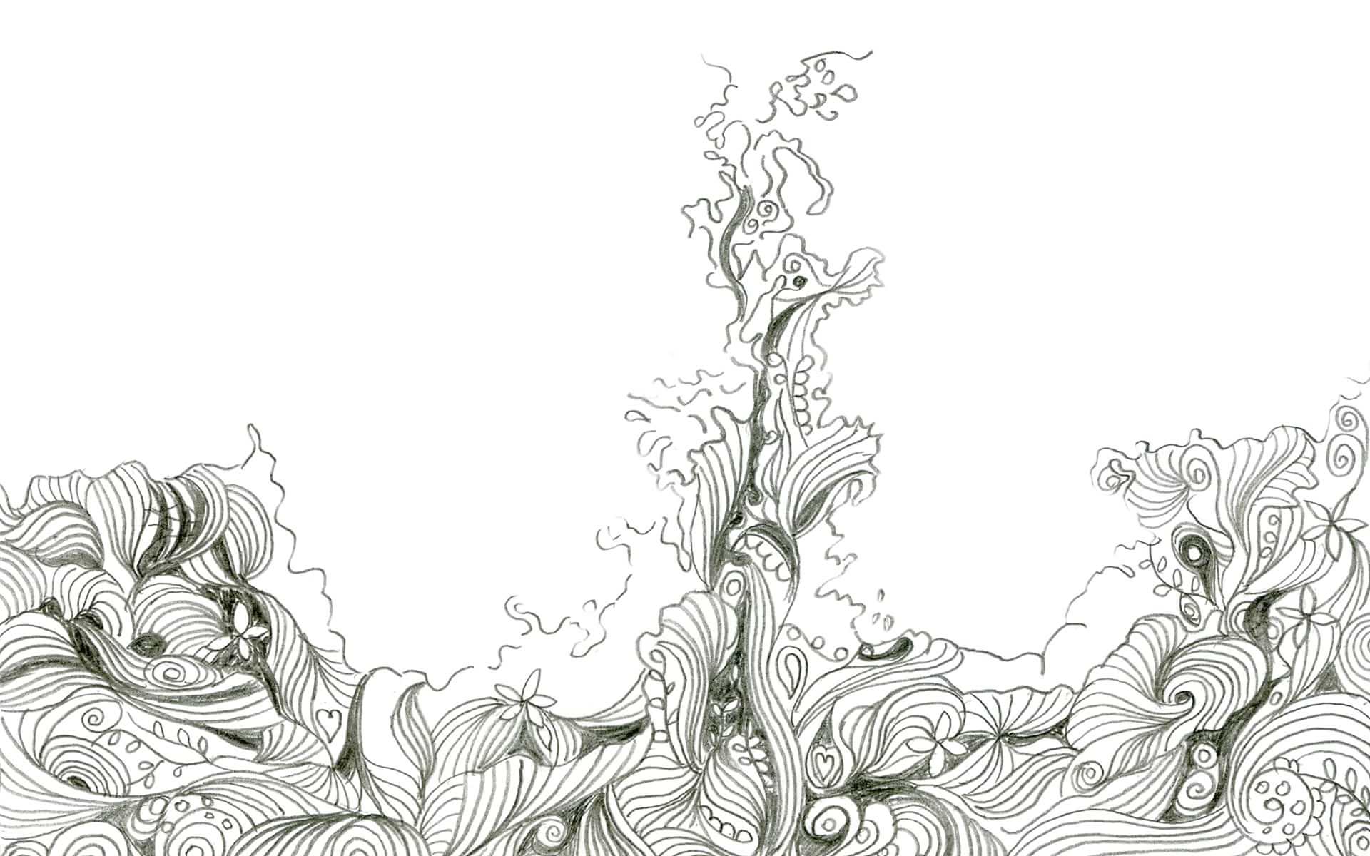
With the rise of stencil artists and their influence creeping into everyday life, spray / drips / splatters are becoming a method of communicating with a large group of todays youth, when applied well, we love this style, its free, expressive and creates levels within a composition that are less restrictive than the rigours of a layout grid. There is scope for a huge amount of experimentation which satisfies our designers as they explore. As it is influenced from urban messages the best of which are honest, an element of anarchy can result. It is infrequently used in the corporate world, as it is less conforming - although notable brands looking for street cred may opt for this route. As a tenuous link, stencil art is loosely related to another finish that we have used, laser cutting. This was a learning curve for us, as our design required intricate finish and we worked closely with the laser cutters to ensure the result lived up to our vision. The client was very impressed with the result, as were the 200 guests that received the solution, a wedding invitation design with simple, clear graphic design utilising the laser cut to allow the colour of different ribbons to shine through, each ribbon connected to an event within the ceremony.
We are seeing white space used in graphic design to good effect of late - striking composition coupled with space can entice a viewer, allowing them to absorb more of the message. This space allows content and viewer to breath. We are also using white out text across imagery to great effect - this can have the benefit of freeing up a cramped layout, as a headline can be over laid on in image in complimentary harmony with great effect. Couple this with cropped text and we gain even more of an image!
In terms of what is driving direction in design presently, environmental issues - as subject matter and of the impact of promotional material on the natural environment are a major motivating factor. We are seeing a much greater interest in recycled paper stocks, biodegradable finishes, soy based inks, methods of commercial waste disposal (printing has traditionally been quite harsh on the natural environment with the use of heavy metals, and the introduction of petroleum distillates in the cleaning process) and the recycling of collateral after it's life-span. Technologies are improving the situation on multiple counts - CTP (Computer to Plate) reduces a step entirely from the print process, benefits include reduced use of materials, less time and lower cost.
The introduction of biodegradable laminates means that protective coatings will last the life of a document - but do not leave an unwanted legacy in their wake. Typically lasting around 10 years and available in matt, silk and gloss, is there really a reason to use anything else?