A logotype is the cornerstone of your Company's brand. It is the first impression that your company shares with the world.
Designing a memorable Logo
The name of a company, and its associated logotype is the beginning of your company's corporate image. Logo design is a key priority for a successful business or brand. Here you will find the main characteristics of a successful and memorable logo.
A memorable logo is:
- Purposeful
When designing a logo, the designer must have a deep knowledge of the clients company. How do they work, what is their target market, their competitors, and their specialised field of expertise… The greater the understanding that the designer has, the better the end result will be. A designer is not an artist, but a graphic communicator, that is why if we have very little to say, we will ultimately create a weaker logo design. The first step of a successful logo design is to create a comprehensive brief, where you can carefully write down all the information about your company, competitors, targets and brand ethics.
- Unique
A logo must be easy to commit to memory. It needs to be memorable, especially if it is special or unusual. There are infinite ways to graphically communicate a message, however, all components should add value to our design, so we have to think carefully when designing. As we are talking about graphic communication, we understand that we have a message to deliver, we need to know the personality/ethics of the company, all the tiny details are the ones that make the biggest difference.
I went to a conference more than 10 years ago, when I was a student. The speaker was Luis Bassat (http://www.luisbassat.com/), a very well known and recognised Spanish publicist. I will never forget this, not just because he is one of my idols, but until this speech, I was always quite sceptical about him and his work. We were sat waiting; the room was completely full of about 200 people, at the front a long table with 6 seats, all-empty. Suddenly, the rooms becomes quiet and a powerful man in a suit enters with fast, strong steps. Once by the chair, his face was serious, he quickly removed his jacket and threw it into the audience emulating a bullfighter’s movement. He then asked for it back, and left the room. A minute later, whilst everyone was talking about what just happened, he came back into the room, calm with a natural face and normal pace. He sits down as a very respectable speaker. Right after, he said, “Good evening guys, I know what you will remember tomorrow. One unique fact, impresses us so much and then dwarfs the rest. If you are not the one that overshadows, then you are overshadowed. You just forget that I have entered twice, and certainly you won’t speak about the second entry, because the first one was so unique.”
As a good communicator, it takes a couple of original ways to describe, or effect the different adaptations to the brand name which make them unique. We use, shapes, colours, shadows, gradients and perspectives, these visual ideas help us communicate the same message in completely a different way.
Examples of unique logos:
![]()
![]()
![]()
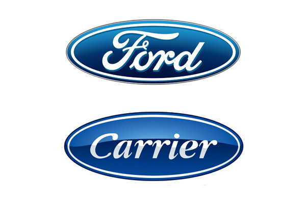
And not so unique:
Ford VS Carrier
Gucci VS Chanel and Sun Microsystems VS Columbia Sportswear

- Symbolic
This is an interesting topic. It creates a lot of confusion and doubts in a designers mind…what is symbolic? Is this iconic? What defines something as a symbol? Let us shed a little light on this issue. The dictionary says that Symbolic means “serving as a symbol” and “something emblematic and illustrative.”

The Eiffel Tour is a symbol of Paris, The Cross is a symbol of Christianity, Red is the colour of communism and the swastika is related to Hitler’s dictatorship. These are some examples of different symbols, which became icons of the occidental world. We can now apply the same concept to brands. A symbol is a recognised and respected form by the users / costumers / or followers because it has a message and a story behind it. Their use has been multiplied and respected for years, so that it is recognisable now. An apple hasn’t always been related to computers, this has been the work of many years of a strong and well-developed logo design.
- Timeless
While fashion comes and goes, a logo must remain stable. We shouldn’t design a logo based on the trend or fashion of that period. A logo must represent the company and capture the essence of a brand, it might experiment and change after the first 10 years, as technologies and society advances. But we should make sure that we redesign our logo, not create a new logo, a classic example of this is the Phillips design. When you have a meaningful logo, you don’t want to lose what made it special once you redesign it, if there’s nothing you want to keep it might be that your logo wasn’t symbolic in the first place, think of The Eiffel Tower.
Check the whole Philips logo evolution.
![]()
- Simple
It’s far easier to remember simple figures and forms, any noise serves to distract and it becomes difficult to read and understand. As in verbal communication, precision and clarity go hand in hand. Whatever isn’t helping the reading or meaning of our design is actually confusing it. Make sure your logo is clean and simple enough to be memorable and clear. Two easy tips; reduce the size of the logo, and check it is still clearly legible, also test your logo in true black & white format (No greys allowed), try to reduce the number of inks in your design, and reduce the number of fonts. Make a clear hierarchy between the icon and the font. In this process you will discover that every single detail of your logo has to add a value, if not it should be removed.
- Adaptable
Our logo is only good if it works in the environment in which it will be used. It’s a common mistake, beautiful logos that look like artwork, but they are not actually functional. You might need to produce a pen with your logo on, or maybe a vinyl graphic for signange, your logo will be shown digitally and in print, you must be prepared for it. When we design a logo, we need to test this logo in different formats; in black and white, digital and print, creating some assets to visually see how it looks and works. Let us say that this would be the MOT of the logo, and even being a beautiful logo, if it creates problems in its usage, then the logo doesn’t actually work. Talking about this, it will be useful to check this responsive logos site for some great examples.
Example of responsive logos. 100% adaptable to the different platforms.
- Not open to misinterpretation
There are many times this has happened, people can see things where you don’t, that were not the intended message. Please make sure you test your logo with different people, and they can give you clear, objective and honest feedback. Clear means that they explain their feedback, not just express it as a feeling. The objective is that this explores the communication of the logo. Feedback like ‘I don’t like pink, or I don’t like/feel this font’ are useless. Good feedback is: Pink is a girly colour, and your business is a gothic tattoo saloon, I don’t think it works. Or, this font is too mechanical / old / serious…)
In some cases, the outcome can lead to undesirable interpretations, this can be extremely dangerous and causes big headaches and expense to the business owners. A misinterpretation of your logo may have disastrous consequences, as some of the examples below show:
Examples of big fails on graphic communication:
Get in touch with a professional brand designer when you are creating the logo design for your company. Our designers have a creative eye, graphic experience and the knowledge to create the best graphic solution for you.